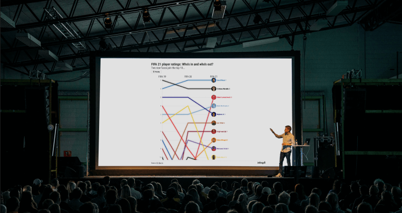
Dynamic data animation
Tell your story with clarity in the most illuminating way possible through our rich, motion based creative data visualisations, used for special TV and web broadcasts, event sequences, PR and key company presentations.
Key benefits
01
Data snapshots - often video clips - cut through to the evidence and the meaning in a fast and exciting way
02
Audiences are drawn to creative, dynamic data visualisations and are more likely to share them over static charts or traditional factbox formats
03
Holds longevity, whether you’re broadcasting history through an evergreen subject or dynamic snapshots that continue to engage returning audiences
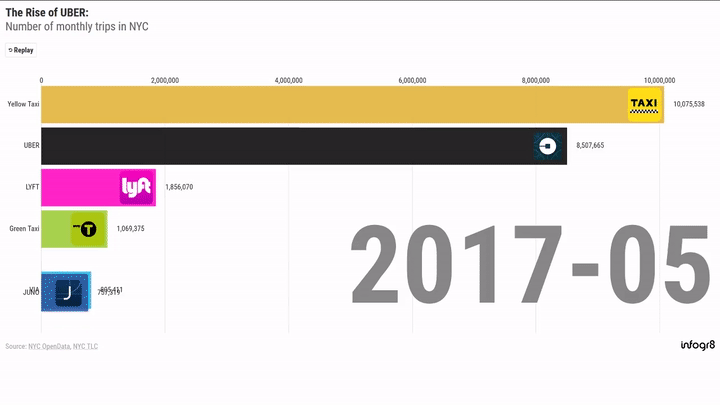
infogr8 | How Uber took over a city
Case studyLet's talk
Get in TouchFAQ
An animated video of an infographic could be made with editing softwares such as Adobe After Effects and Adobe Premiere. There are more specialised tools where you can input the data such as Flourish and Tableau.
A bar chart is an easy way to compare data. When animated, it becomes an effective and engaging way to show how data changes over time.
Examples of infographic videos are How Uber took over a city (https://dev.infogr8.com/our-work/infogr8-how-uber-took-over-a-city/) and Spotify early song usage consumption patterns (https://dev.infogr8.com/our-work/spotify/).