Infographic Series
Picker Institute Europe
The development of a distinct visual design language that communicates key findings to the health care community
Challenge
-
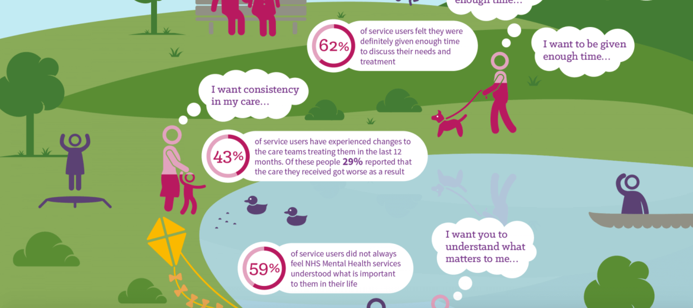
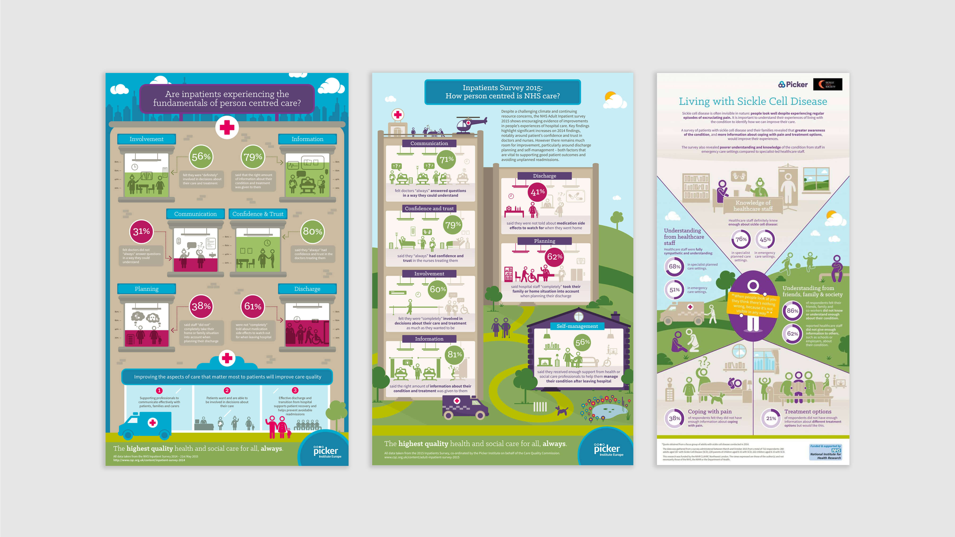
Picker Institute Europe weren’t new to the game of infographics and they wanted a creative approach to their already unique brand guidelines.
The main objective was to share the key findings of their 2014 survey results by showing a patient’s care journey.
Solution
-
As these Surveys are released on a specific day, we had to play around with dummy data and prepare the content for the final data release.
The creative solutions we came up with, were all easily adjustable so we could work quickly once the final data was released. Also, the final infographic needed to be repurposed for social media so we’ve taken a modular approach that will easily allow us to optimise for micro content for Twitter.
Results
Award
NIHR Let's Get Digital Awards (Living with sickle cell disease)